There’s a moment in almost every brand project I take on where something shifts. It’s not usually dramatic. It doesn’t happen on the first call or even the second round of revisions. It happens quietly, somewhere in the middle of the process, when a client looks at what we’ve built together and the words that come out are some version of “that’s it, that’s what I’ve been trying to say.”
I live for that moment. Not because it means the project is done, but because it means the gap has finally closed. The version of her business that’s been living in her head, the one she’s been trying to communicate for months or years through DIY graphics and rewritten bios and websites she’s embarrassed to share, is now sitting in front of her in a form that other people can see and understand too. And the relief on her face when that happens is something I never get tired of witnessing.
This post is about that moment. What leads up to it, what makes it possible, and what changes on the other side. Because I think a lot of women who are considering investing in their brand identity design have a hard time imagining what the outcome actually feels like. They can picture a new logo. They can imagine a nicer website. But the deeper shift, the one where your brand finally matches the vision God has been building in you, is harder to visualize until you’ve lived it.
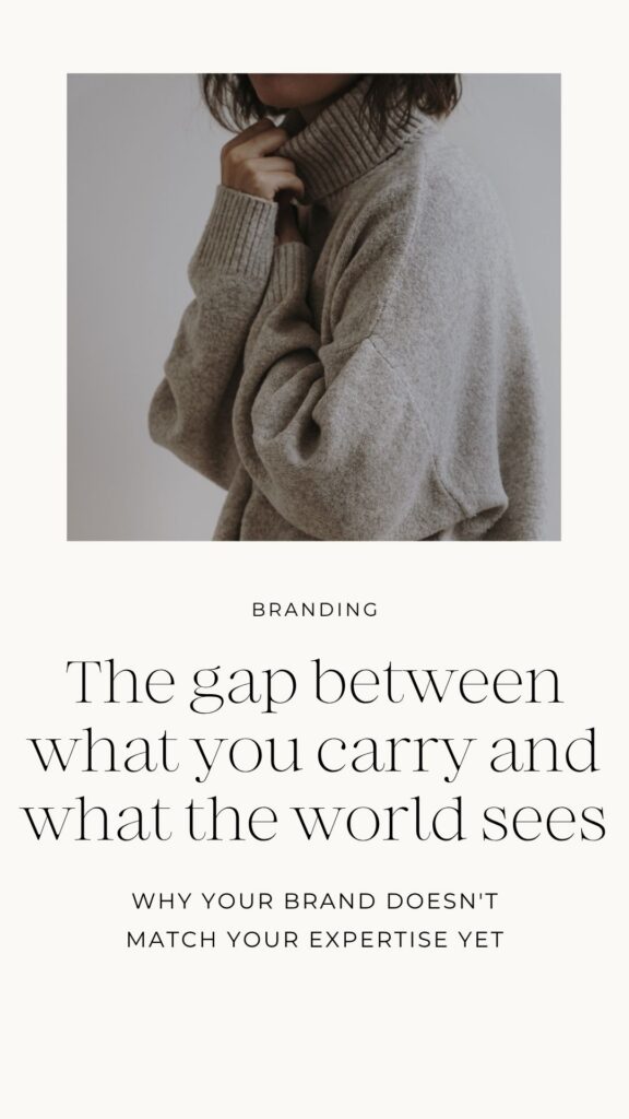
The gap between what you carry and what the world sees
Most of the women I work with are not starting from zero. They’ve built something real. They have clients, revenue, momentum, and a genuine calling behind what they do. The problem isn’t that they don’t know who they are or what they offer. The problem is that their brand doesn’t reflect any of it accurately.
There’s a gap between what she carries internally, her expertise, her vision, her faith, her depth of experience, and what the world actually sees when they land on her website or scroll past her Instagram. She knows she’s good at what she does. Her clients know it too. But a stranger encountering her brand for the first time wouldn’t necessarily get that impression, because the brand is communicating an earlier version of her. A version that was building, experimenting, figuring things out. Not the version that has arrived and is ready to lead.
That gap creates a specific kind of frustration. She can feel it every time she sends someone to her website and adds a verbal disclaimer. Every time she introduces herself at a conference and watches the person’s face shift when they later look her up online and the brand doesn’t match the authority she carried in person. Every time she writes a caption and agonizes over it because the visual identity surrounding it doesn’t feel like her, so the words have to work twice as hard to compensate.
The gap isn’t about aesthetics. It’s about alignment. And closing it requires more than a fresh coat of paint.
Why most brand refreshes don’t actually close the gap
A lot of women try to fix this by updating pieces of their brand. New logo. New colors. New headshots. Maybe a website redesign where the layout is cleaner and the photos are better. And those things can genuinely improve how a brand looks on the surface.
But if the strategy underneath the brand hasn’t changed, the new visuals are just sitting on top of the same unclear foundation. The brand might look more polished, but it still won’t feel right. The messaging will still be slightly off. The website will still attract the wrong people or confuse the right ones. The client will still feel that low-grade discomfort when she looks at her brand, because the core alignment issue was never addressed.
This is how women end up in the cycle of rebranding every year or two. Not because they chose bad designers, but because each project was scoped as a visual refresh when it was actually an alignment problem. The visuals aren’t the issue. The gap between identity and expression is.
Closing the gap for real requires going back to the foundation. Who are you serving now, not three years ago. What does your business actually communicate versus what you think it communicates. How is your brand positioned relative to others in your space. What does your messaging need to do to attract the right person and make her feel like she’s found the right place. When those questions are answered with honesty and strategic depth, the design that follows doesn’t just look better. It works.
What a brand transformation actually looks like (the La Vie project)
Jennifer Nicholson’s project is one of the clearest examples I can point to of what this transformation looks like from start to finish.
Jennifer is a clinician with a background in occupational therapy and lifestyle medicine. She had spent years watching the same pattern play out in traditional healthcare: symptoms treated, patients improved temporarily, and then they came back because the real drivers of long-term health, the daily habits and routines and choices, were never addressed. She knew she was meant to educate women on those things, and she was ready to take that expertise online and build a wellness education platform.
But her existing brand was still tied to her clinical practice. It communicated “healthcare provider” when what she needed to communicate was “trusted wellness educator.” The brand didn’t reflect where God was leading her, and it didn’t give a first-time visitor any sense of the warmth, depth, and accessibility Jennifer brings to her work.
The biggest challenge with La Vie wasn’t the design. It was the positioning. Jennifer has deep clinical expertise, but she isn’t providing clinical services online. She’s educating. That distinction matters more than most people realize, and the brand needed to reflect it at every level.
Too clinical and her ideal audience, everyday women who want real health guidance without the noise, would assume she wasn’t for them. Too lifestyle-driven and she’d blend into the sea of wellness content that prioritizes aesthetics over substance. We positioned La Vie right in the space between those two things: evidence-based and grounded, but warm and genuinely accessible.
That positioning became the foundation everything else was built on. The warm neutral palette with muted olive, plum, and wine accents communicates calm authority without feeling sterile. The typography pairs a classic serif with a clean script, balancing sophistication with approachability. The Squarespace website was structured to educate first and convert second, because that is exactly what Jennifer’s audience needs before they invest in a program. Every page guides visitors through a trust-building journey instead of hitting them with a hard sell.
Every single visual decision connected back to the brand strategy. The colors weren’t chosen because they were trending. The layout wasn’t borrowed from a template that looked nice. Each element communicates something specific to the right person, and together they create a brand that says exactly what Jennifer does, who she serves, and why her approach is different, all within the first few seconds of someone landing on her site.
Jennifer said partway through the project that she felt encouraged to finally see her vision moving forward. That is the moment I was talking about at the beginning of this post. The moment the gap closes and the client can see herself in what we’ve built.
The shift that happens when alignment finally clicks
When a brand finally matches the vision you’ve been carrying, the change isn’t just visual. It’s operational, emotional, and spiritual.
Operationally, things get simpler. Your content becomes easier to create because you’re not starting from scratch every time you write a caption or design a graphic. You have a brand voice, a visual system, and messaging pillars that guide everything. Your website starts doing the positioning work for you, which means discovery calls feel less like pitches and more like conversations with someone who already understands what you do. You stop rewriting your bio every month because the one you have actually says what you mean.
Emotionally, the second-guessing quiets down. You share your website link without adding a verbal caveat. You post content without agonizing over whether the visual identity “matches.” You feel represented by your brand instead of embarrassed by it, and that shift in confidence shows up in ways you wouldn’t expect. How you price your offers. How you show up on calls. How you talk about your business to other people. When you feel aligned with your brand, you lead differently.
And spiritually, there’s a settledness that comes from knowing your brand reflects the work God has been doing in your business. Not a version you manufactured to look good online, but an honest expression of where He’s leading you and who He’s calling you to serve. That alignment between calling and expression is what I mean when I talk about a brand that feels like home. It’s not about perfection. It’s about truth, made visible.
What makes this kind of transformation possible
I want to be specific about what creates this result because I think there’s a lot of mystery around brand identity design that doesn’t need to be there.
The transformation doesn’t come from a designer with better taste than the last one. It doesn’t come from spending more money or taking more time, although both of those things can help when they’re applied in the right places. The transformation comes from a process that starts with strategy and doesn’t skip any steps on the way to design.
That means real conversations about positioning, not a questionnaire. Honest assessment of what’s working and what isn’t, even when the answer is uncomfortable. A collaborative relationship where the client has room to think, reflect, and make decisions from a grounded place instead of under pressure. And a designer who understands that the meaning behind the visuals is just as important as the visuals themselves.
When I built La Vie with Jennifer, the design phase was actually relatively straightforward. Not because the project was simple, but because the strategy phase had done its job so thoroughly that every design decision had a clear direction behind it. The positioning was defined. The audience was understood. The messaging was articulated. So when it came time to choose colors, build the logo system, and structure the website, we weren’t guessing. We were executing a vision that had already been shaped by weeks of strategic thinking.
That’s the difference between a brand that looks good and a brand that works. And it’s why I will always advocate for doing the strategy work first, even when the client feels eager to jump straight to design. The strategy is what makes the design meaningful.
If you’ve been carrying a vision that your brand doesn’t reflect yet
Then you already know the gap I’ve been describing. You feel it every time you look at your website, every time you introduce yourself and wish your brand could do the talking for you, every time you wonder whether the right people are finding you or whether your online presence is quietly turning them away.
That gap doesn’t close on its own, and it doesn’t close by updating one piece at a time. It closes when someone sits down with you, looks at the full picture, and helps you see what’s actually going on and what needs to shift.
The Brand Alignment Audit is built for exactly that. It’s free, it’s thorough, and it will give you an honest look at where your brand stands right now relative to where you’re actually going. Sometimes the gap is smaller than you think and the path forward is clearer than you’d expect. Sometimes the audit reveals something you hadn’t considered, and that clarity alone changes how you approach your next step.
Either way, you stop guessing. And you stop carrying a vision that nobody else can see.
Your brand has been growing with you through every season of your business. It deserves to finally look like it.
More resources
- Why brand strategy has to come before design and what happens when it doesn’t
- Why your website won’t work without branding
- The 4 stages of creating your brand
- The difference between your brand being outdated and outgrown
- Why the branding process shouldn’t be rushed
- How to refresh your brand without starting over
Save for Later
Enjoy this post? Pin it to Pinterest so you can find it again later.