Let’s imagine that you’re scrolling through Instagram, eyes glazed over, when suddenly – BAM! – a post stops you in your tracks. The brand color palette is vibrant, the design is on-point, and you find yourself instantly captivated.
“Whoa, who made this?” you wonder, double-tapping faster than you can say “brand aesthetic.” The secret sauce? Their brand color palette. It was bold, it was beautiful, and most importantly, it felt intentional. No random mashup of hues here – everything worked together in perfect harmony.
But here’s the thing: it’s not just about making your visuals look pretty. Color accessibility is a crucial (yet often overlooked) piece of the puzzle. After all, if your palette doesn’t meet accessibility standards, you could be alienating a significant portion of your dream clients without even realizing it.
Lucky for you, I’m about to hook you up with 10 stunning color palettes that are guaranteed to make your brand stand out. Get ready to make some jaws drop (and your audience fall head-over-heels for your visual identity).
10 Jaw-Dropping Brand Color Palette Ideas (with Hex Codes!)
Let’s get straight to the fun part. Here are 10 showstopping brand color palette ideas to get those creative juices flowing:
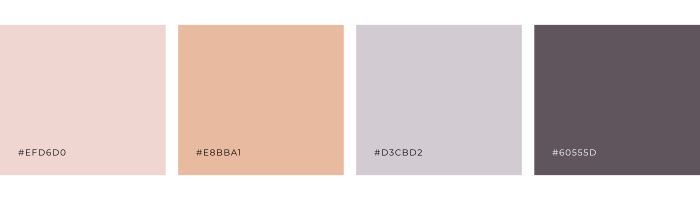
1. Primary: #EFD6D0 | Secondary: #E8BBA1 | Accent: #D3CBD2 | Neutral: #60555D
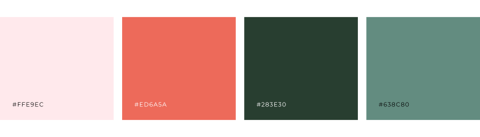
2. Primary: #FFE9EC | Secondary: #ED6ASA | Accent: #283E30 | Neutral: #638C80
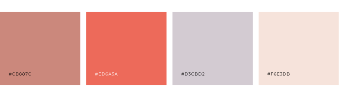
3. Primary: #CB887C | Secondary: #ED6ASA | Accent: #D3CBD2 | Neutral: #F6E3DB
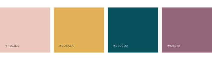
4. Primary: #F6E3DB | Secondary: #ED6ASA | Accent: #E4CCDA | Neutral: #926578
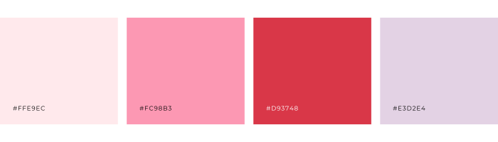
5. Primary: #FFE9EC | Secondary: #FC98B3 | Accent: #D93748 | Neutral: #E3D2E4
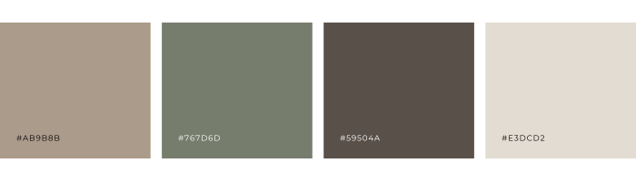
6. Primary: #AB9B8B | Secondary: #767D60 | Accent: #59504A | Neutral: #E3DCD2
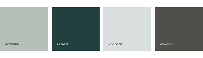
7. Primary: #B7C0B6 | Secondary: #22413E | Accent: #D9DFDF | Neutral: #514F4B
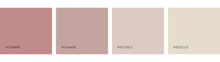
8. Primary: #C08B89 | Secondary: #C4A49E | Accent: #DCCBC2 | Neutral: #E5DCCE
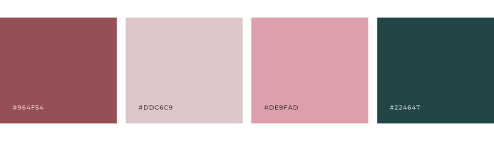
9. Primary: #964F54 | Secondary: #DDC6C9 | Accent: #DE9FAD | Neutral: #224647
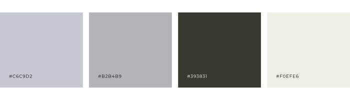
10. Primary: #C6C9D2 | Secondary: #B2B4B9 | Accent: #393831 | Neutral: #F0EFE6
Now, I know what you’re thinking – “But those are all so gorgeous! How do I know which one is right for my brand?”
Here’s the thing: the “best” brand color palette isn’t about picking the prettiest combo. It’s about choosing colors that truly resonate with your brand’s personality and visual identity.
Maybe you’re going for a sleek, modern look. In that case, the Moody Minimalist palette might be right up your alley. Or perhaps you want to evoke a sense of warmth and approachability – the Cozy Comfort palette could be perfect.
The key is to think about the emotions and feelings you want your brand to convey, then select colors that align with that vibe. But there’s one more super important factor to consider: accessibility.
Why Color Accessibility Matters (And How to Nail It)
Here’s the deal: color accessibility isn’t just a nice-to-have – it’s an absolute must for any brand (especially an online brand) that wants to create an inclusive, user-friendly experience.
You see, not everyone perceives color the same way. People with visual impairments like color blindness or low vision may struggle to read your content or navigate your website if the colors you choose don’t provide enough contrast.
And let’s be real – even folks with perfect 20/20 vision can have a hard time if the colors you use are too similar or don’t play nicely together.
That’s why it’s crucial to test your brand color palette for accessibility so you know how to use the colors together. Tools like WebAIM’s Color Contrast Checker can help you ensure your colors meet the Web Content Accessibility Guidelines (WCAG) standards.
The bottom line? Accessible design isn’t just the right thing to do – it’s also smart business. When you create content that’s easy for everyone to engage with, you’ll attract more clients, boost conversions, and build a loyal community that feels seen and valued.
Ready to Pick Your Perfect Palette?
So, there you have it – 10 stunning brand color palettes to choose from. Whether you’re building a brand from scratch or sprucing up an existing one, these combos are guaranteed to make your visuals pop.
The next step? Get out there and start experimenting! Pair these colors with your brand’s unique personality, sprinkle in some killer design, and watch your audience fall head-over-heels for your brand.
Oh, and don’t forget – if you ever need a little extra color inspo or have questions about accessibility, I’m always here to lend a hand. After all, Intentionally Designed is all about empowering entrepreneurs like you to create brands that are as amazing as you are.
More Resources
- How to choose brand colors
- The do’s and don’ts of brand colors
- FREE Brand Color Guide
- Brand Style Workbook
- Premade Brands
Save for later
Enjoy this article and find it helpful? Pin this image on Pinterest so you’ll always have this info on hand!