Choosing the right brand font pairings can feel overwhelming when there are thousands of options and no clear rules for what goes together. The truth is that a strong font pairing comes down to contrast, complementary styles, and purpose. Each font in your palette should serve a distinct role, and the combination should reflect your brand’s personality without competing for attention.
I’ve put together ten curated brand font pairings below, each with a breakdown of why the combination works and the kind of brand it’s best suited for. If you’re not sure how many brand fonts you actually need, start there first, then come back to find the right combination.
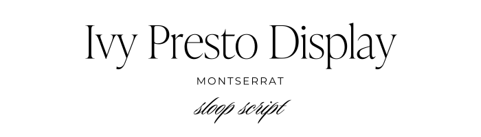
Ivy Presto Display, Montserrat & Sloop Script
Why it works: Ivy Presto Display offers a striking, sophisticated serif design, Montserrat adds a modern, clean touch, and Sloop Script introduces elegance with a delicate, handwritten feel. Together, they create a balanced blend of tradition and modernity.
When to use it: This trio is perfect for upscale brands that want to communicate luxury with a contemporary twist.
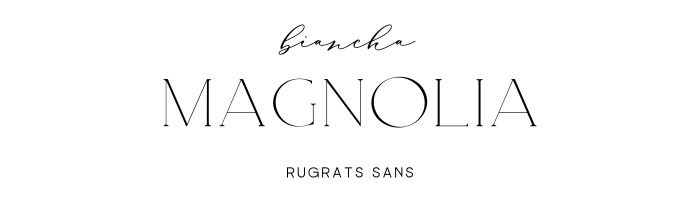
Magnolia, Rugrat Sans & Biancha
Why it works: Magnolia’s bold and expressive strokes command attention, Rugrat Sans adds a playful vibe, and Biancha rounds things off with a soft, handwritten style. This brand font pairing is bold, quirky, and fun.
When to use it: Ideal for creative, child-focused, or lifestyle brands that want to inject a bit of personality into their identity.

Oswald & Source Serif
Why it works: Oswald’s condensed, strong letterforms make a bold statement, while Source Serif’s classic and readable design keeps things grounded and professional.
When to use it: This pairing works well for brands that need to assert authority and reliability while still being modern and approachable.

Poppins & Noto Serif Display
Why it works: Poppins is a modern, geometric sans-serif that pairs beautifully with Noto Serif Display’s elegant, high-contrast design, creating a combination that’s both striking and easy to read.
When to use it: Perfect for brands that want to blend modern aesthetics with classic sophistication.
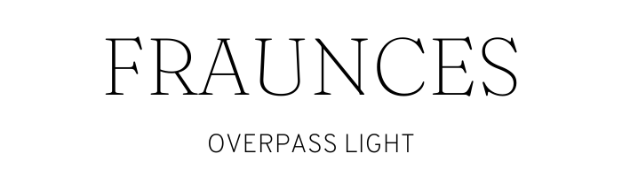
Fraunces & Overpass Light
Why it works: Fraunces is a dynamic, modern serif with a bit of vintage flair, while Overpass Light is sleek and minimal. Together, they create a perfect balance of old meets new.
When to use it: This pairing is great for lifestyle brands that want to combine a touch of nostalgia with contemporary elegance.
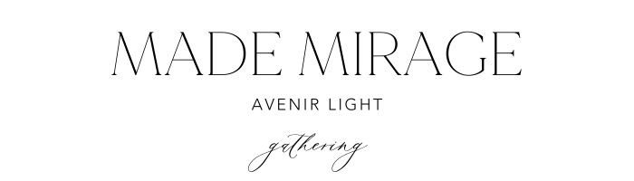
Made Mirage, Avenir Light & Gathering Script
Why it works: Made Mirage’s modern elegance is complemented by Avenir Light’s clean, minimalist design, while Gathering Script adds a flourish of personality with its handwritten style.
When to use it: This trio is ideal for fashion, beauty, or creative brands that want to exude elegance and sophistication.
Novara, Avenir Light & Mistograph Script
Why it works: Novara’s distinctive and sharp design pairs beautifully with Avenir Light’s modern simplicity, while Mistograph Script introduces a soft, handwritten touch for added warmth.
When to use it: Perfect for luxury brands looking to combine modern aesthetics with a personal, approachable touch.
Abramo & Futura Light
Why it works: Abramo’s bold, elegant serif design contrasts beautifully with Futura Light’s geometric and clean appearance, creating a brand font pairing that’s both timeless and modern.
When to use it: This combination is ideal for brands that want to merge traditional elegance with a modern, forward-looking vibe.
Harmoni & Poppins Light
Why it works: Harmoni offers a refined, classic serif design, while Poppins Light is clean, modern, and approachable. Together, they create a balance that’s sophisticated yet friendly.
When to use it: Use this pairing for brands that want to convey trust, reliability, and modern sensibilities.

Alta & Merriweather
Why it works: Alta’s clean, contemporary look pairs perfectly with Merriweather’s warm, inviting serif design, creating a combination that’s both modern and welcoming.
When to use it: This brand font pairing is great for brands that want to communicate a sense of warmth and accessibility while still being professional.
Your fonts should reflect your brand strategy
A beautiful font pairing is a meaningful starting point, but fonts work best when they’ve been chosen as part of a larger brand strategy. The right typography should reflect your positioning, resonate with your specific audience, and feel cohesive across every touchpoint, from your website headers to your Instagram captions to the proposals you send to potential clients.
I’ve spent over 14 years helping women entrepreneurs build brands that are rooted in strategy and expressed through intentional design, and one of the most common patterns I see is a business owner who has gorgeous fonts and colors but still feels like her brand doesn’t fully represent who she is or what she does. The visual elements are only one layer. When the strategy underneath them is clear and solid, the design choices amplify that clarity in a way that actually attracts the right people.
If you love the pairings above but you’re not sure which one actually fits your brand’s personality and positioning, a free brand alignment audit can help you figure out where things stand and what your brand actually needs right now. And if you’re at the point where you want a professional to build the full picture, strategy through design, you can learn more about working together here.
Recap
Your brand font pairings communicate your brand’s personality before anyone reads a word of your copy. Whether you’re drawn to something bold and modern or classic and refined, choose fonts that contrast purposefully, serve distinct roles, and feel aligned with who you are and who you’re trying to reach. The right combination, used consistently, becomes one of the quiet forces that makes your brand feel cohesive and recognizable over time.
More Resources
- How to choose brand fonts and the best font resources
- 3 things to remember when pairing brand fonts
- The do’s and don’ts of brand typography
- Understanding font licensing and legally using fonts on your website
- Brand Style Workbook
Save for later
Enjoy this article and find it helpful? Pin this image on Pinterest so you’ll always have this info on hand!