Imagine that you’re scrolling your favorite font sites looking for brand fonts and you love them all. You’ve sourced too many inspiration pics to count and you’ve added countless fonts to your cart, ready to purchase. But now you’re wondering – how many brand fonts are too many? It’s a common question and one that can make or break your brand’s identity. The right number of fonts can create harmony and cohesion, while too many can turn your branding into a chaotic mess. So, let’s cut through the confusion and find out exactly how many brand fonts you should be using to keep your brand looking sharp and professional.
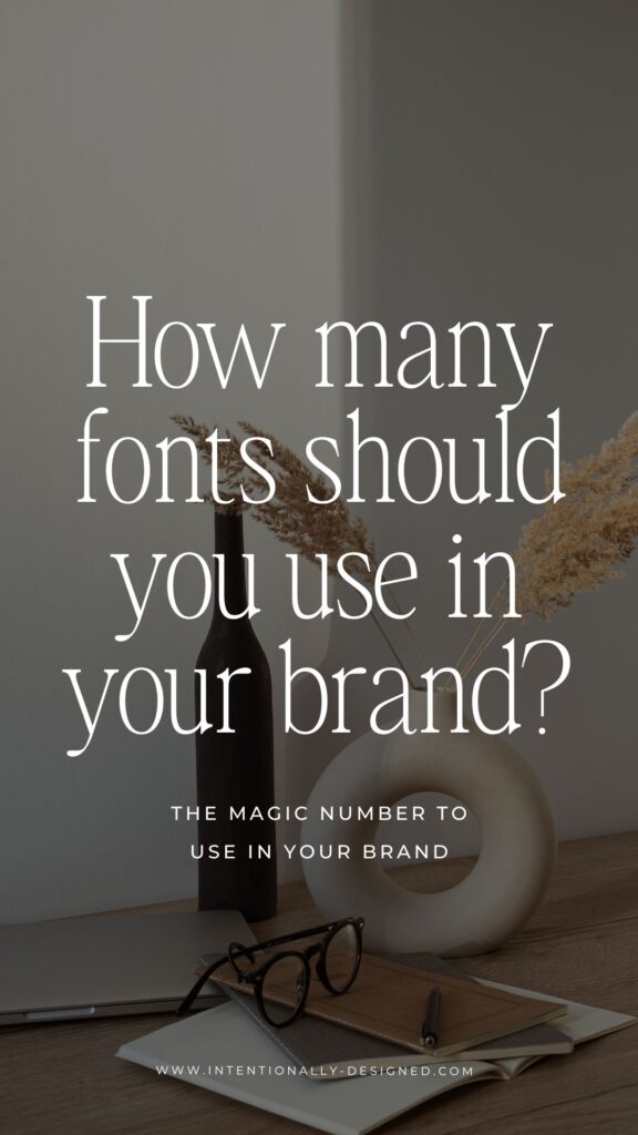
Keep It Simple – The Magic Number is Three
First things first, less is more. A good rule of thumb is to stick to three brand fonts: a primary font, a secondary font, and an accent font. Your primary font will be the workhorse, used for most of your body text. The secondary font should complement the primary one and can be used for headings and subheadings. The accent font is your chance to add a little flair – think logos or special callouts. By limiting yourself to three fonts, you create a consistent look that’s easy on the eyes and helps your audience recognize your brand instantly.
Pairing with Purpose – Choosing Fonts that Work Together
When selecting your three brand fonts, it’s important to choose ones that work well together. Think of it like creating a recipe – each ingredient needs to complement the others to make the final dish delicious. Start with your primary font, which should be clear and readable. Then, choose a secondary font that contrasts but doesn’t clash – a different style or weight can add visual interest without being jarring. Finally, pick an accent font that adds personality but is used sparingly to avoid overpowering the other elements. Remember, the goal is harmony, not competition.
Flexibility and Consistency – Why These Fonts Matter
Using a limited number of brand fonts helps maintain consistency across all your brand materials, from your website to your business cards. This consistency builds trust and recognition with your audience. But don’t worry – sticking to three fonts doesn’t mean your design will be boring. With different weights, styles, and sizes, you can create plenty of variation and interest. Plus, having a set font palette makes it easier to create new materials quickly, knowing they’ll always align with your brand’s look and feel.
Recap
So, how many fonts should you use in your brand? Three is the magic number. Keeping it simple with a primary, secondary, and accent font ensures your brand looks cohesive and professional. Pair your fonts thoughtfully to create visual harmony, and remember that consistency is key to building recognition and trust with your audience. With the right font combination, your brand will be ready to stand out in the best possible way.
More Resources
- How to choose brand fonts and the best font resources
- 3 things to remember when pairing brand fonts
- The do’s and don’ts of brand typography
- Understanding font licensing and legally using fonts on your website
- Brand Style Workbook
Save for later
Enjoy this article and find it helpful? Pin this image on Pinterest so you’ll always have this info on hand!