
Your website is an extension of your brand so therefore your brand colors need to be represented consistently on your website. Using your brand colors effectively on your website, ensures that every hue harmonizes with purpose. It’s not about slapping some colors around and hoping it looks good; it’s about making sure your brand colors are accurately represented on your website. Here’s how you can use your brand colors on your website for consistency.
Establish Your Color Hierarchy
Before you start playing around with colors on your website you want to lay the foundation with a color hierarchy. Define the primary, secondary, and accent colors of your brand. Think of them as the protagonists in your visual story, each with a role to play. This hierarchy will guide the viewer’s eye, create cohesion, and make your website a symphony of color that resonates with your brand identity.

Add Your Color Settings
Now, let’s translate your color hierarchy into the language of Showit. Head to your dashboard and locate the design settings. Here, you’ll find the color palette—your artistic palette for this digital canvas. Add your primary colors first, establishing the base for your website’s visual language. Then, seamlessly weave in your secondary and accent colors. As you add each shade, visualize the impact it will have on different elements—headings, buttons, backgrounds. While you want to add your colors in the settings from darkest to lightest, you also want to note which colors will be used for which element.
Implement Your Colors Accordingly
With your color palette in place, it’s time to bring your website to life. Your brand colors aren’t just splashed randomly; they’re strategically placed to guide the user’s journey. The primary color might adorn your headings, the secondary color could accentuate buttons, and the accent color could bring attention to interactive elements. This intentional use of color elevates your website from a digital space to a visual experience that authentically reflects your brand.
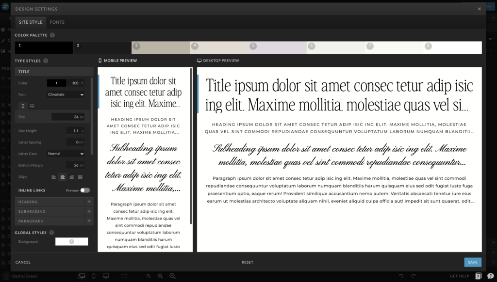
Now this is also where the magic of Showit comes in handy. Your color settings will automatically be applied to the right headings based on what you set up in the dashboard. But you also have the freedom to change individual colors when necessary. Navigate to the individual elements of your site—headings, text, buttons, and backgrounds. For each element, make sure to assign the appropriate color from your palette if it wasn’t automatically assigned.
Recap
Each of your brand colors has a role in telling a part of your story, and together they create a visual symphony that resonates with your audience. If they aren’t represented consistently on your website, then your website won’t align fully with your brand. Make sure that your brand color hierarchy is carried over to your website for color consistency.
Next Steps
Need help choosing your brand colors? Grab the FREE brand color guide and palette library to get started. Then take it a step further with the Brand Style Workbook to clearly define your full brand style. Once you have your brand aesthetic established, you can polish off your brand visuals with a premade brand for an effortlessly elevated brand.
More Resources
- How to choose brand colors
- The do’s and don’ts of brand colors
- FREE Brand Color Guide
- Brand Style Workbook
- Premade Brands
Save for later
Enjoy this article and find it helpful? Pin this image on Pinterest so you’ll always have this info on hand!