DIYing your website is sort of like a right of passage that every business owner goes through at some point. Most of us have at least one (probably embarrassing) DIY version of our website. In the beginning stages of your business, building your own website may be the best way to go, but that also makes it easier to miss certain details and elements that could be hurting your credibility and sales. Here are 7 of the most common website mistakes I see among DIYers and quick ways to fix or avoid them.
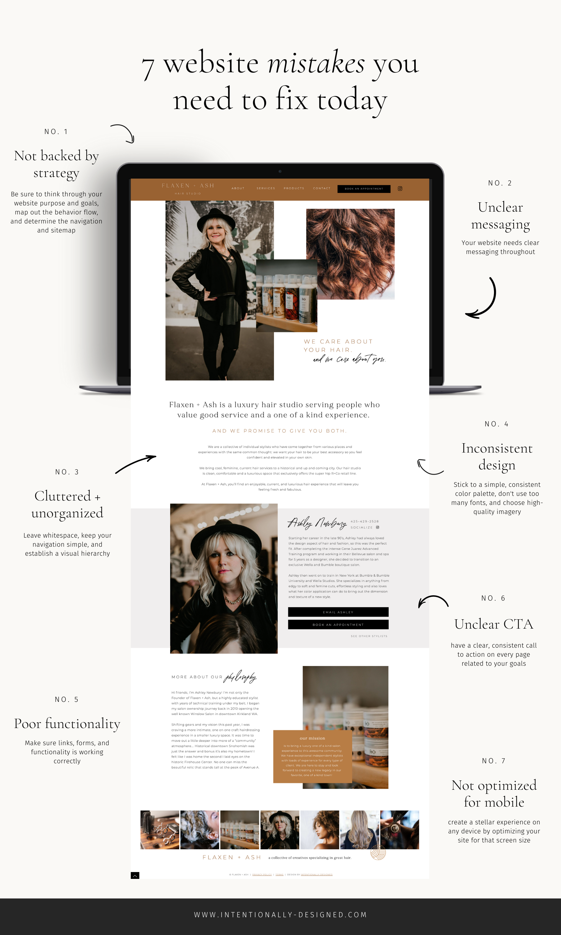
Mistake 1 – Not backed by strategy
I can’t tell you how many people I know who have attempted to build a website without ever thinking about the strategy behind it. I am a big believer in having a strategy (or basically a plan) for everything you execute in your business, and your website should have its own dedicated strategy.
When it comes down to it, there are a lot of tiny details that go into a website. And you need to put some thought behind the pages that you are building so that it actually makes sense and does its job. Otherwise, you might end up with a gorgeous site that doesn’t convert for your business.
Instead of diving into the design and layout of your website first, take some time to write out a strategy. You want to revisit your brand foundation, determine your website purpose and goals, map out the behavior flow, and determine the navigation and sitemap.
Mistake 2 – Unclear messaging
One of the biggest mistakes I see people making with their DIY website is not spending enough time on the copy and messaging. When you think of a website you think about the end result of beautiful pages and fancy features. But one of the most important pieces of the puzzle is the content of those pages.
A confused visitor will quickly click the X on your site. Your website needs clear messaging throughout. Unclear messaging probably means that you are confused about your strategy. This is where it comes in handy to have your brand strategy nailed down before you build your website because the foundation you establish with that strategy is what guides the messaging on your website.
Instead of writing pages of long copy, try to keep it clear and concise. Clarity wins over cleverness every time. Your brand statement should be above the fold on your home page as the main hook into your site and it should continue throughout from there. Overall, the copy and messaging on your website should be more about your audience, not about you.

Mistake 3 – Cluttered and unorganized website
There is nothing I hate more than going to a website and feeling like I have to sift through 100 things to find what I am looking for. A big component of every website I build is organization because not only do you want to present the right information to your visitor in a beautiful way, but you also want to make sure they aren’t overwhelmed by info or can’t find their way around your site easily.
If someone reaches your site and can’t figure out what is going on, they will most likely just leave, which defeats the purpose of your website. Your website doesn’t have to include every piece of information and content possible. It just needs the most important based on your goals (which goes back to your strategy – see how that works?!).
Instead of cluttering your website with all the things, be sure to leave plenty of whitespace for breathing room, keep your navigation simple, and establish a visual hierarchy by ranking information by importance. You also want to make sure that you consider readability and legibility with your text alignment and spacing. For example, don’t let long text blocks go the full width of the page
Mistake 4 – Inconsistent design
The design of your website is what gives your visitor the first impression. And first impressions are everything. You want to make a good first impression with a breathtaking design. But even beyond that, you want your design to remain consistent throughout your site.
Inconsistent design makes your site look unprofessional. If you’ve got too many colors, several different fonts, and less than cohesive imagery, your site is going to look like a hot mess. And no one wants to work with a business that looks like that.
Instead, try sticking to a simple, consistent color palette, don’t use too many fonts, and choose high-quality imagery. You want to utilize strong visuals to establish trust and credibility with your site. Keep the overall design of your site clean, consistent, and simple.
If you don’t have a consistent brand established before you start building your site, you’ll end up using whatever fonts and colors look good in the moment and that will almost certainly lead you down a path of disaster. I recommend nailing your brand style or establishing a brand identity first to guide the design of your site for a more consistent look.
Mistake 5 – Bad functionality
Your website is there to do a lot of jobs for your business. It’s there to attract leads and clients, make sales, grow your email list, and more. But if it doesn’t actually function correctly, it won’t be able to do its job well.
Another big website mistake people often make (I am guilty of these myself) are having broken links or forms, having a slow-loading website, or giving an overall bad experience through poor functionality of the site.
By the time you get to the end of your website build, you are probably ready to hit launch and be done with it, but one of the most important things you can do is test and retest the functionality of your website before it goes live. As you are building your site you want to think about how to optimize the functionality and workflow for your visitor and the backend of your business, but you also want to be sure to test those things for accuracy too.
Instead of assuming it’s right, click on all the links of your site to make sure they go to the right place, send test forms to make sure they work and trigger and workflow functions properly, test shopping or checkout functions, and check your site load speed. Make sure that anything the user will need to do on the site works.
Mistake 6 – Not optimized for mobile
Most website platforms are built to be automatically responsive, but that doesn’t mean you can ignore the mobile design and experience. With so many users viewing our sites on their phones, you want to make sure that you are creating a quality mobile experience just as much as the desktop version.
Instead of putting all the emphasis on the desktop version of your site (and telling people to view it there for a better experience), create a stellar experience on any device by optimizing your site for that screen size. This could mean that elements are laid out differently for mobile or left off completely for a better experience.
And don’t forget to check your website on your phone. While there are great ways to view the mobile version of your site while building, nothing compares to the experience on your phone.
Mistake 7 – Not asking them to take action
People need to be told what to do next. If there isn’t a clear call to action they may leave confused about what to do or where to go next. This ties in with having a clear message and strategy, but the CTAs of your site are super important. After all, you want people to take action on your site not just admire and leave.
Instead of letting them decide what to do, be sure to have a clear, consistent call to action on every page. You want to keep this focused too. Don’t send them in too many directions or they will be overwhelmed by the choices. Determine 1-2 places they need to go next based on the goal of the page and the goal of your site.
Don’t forget that design and text matter here. You want your CTAs to be label clearly and obviously with the right button text and color. You also want to be sure to put your call to action in a prominent location on each page that makes sense with the rest of the content.
Recap
Building your own website has its benefits, but can also result in a few common mistakes that can easily be fixed. If you are DIYing your website, take some time to make sure that these top 7 website mistakes are avoided for an optimal website.
Next Steps
Notice any of these mistakes on your site? Do a quick evaluation and then use the tips to make any necessary fixes. And if you’re stuck building your site and want a little help – check out the website templates for a strategically built, premium template that will help ensure these mistakes aren’t made.
More Resources
- 3 Things that need to happen before you build your website
- How to DIY your website the right way
- 4 pages you should have on your website you probably didn’t know about
- The Brand Strategy Blueprint course
- The Website Planner and Content Workbook
- Showit Website Templates
Save for Later
Enjoy this article and find it helpful? Pin this image on Pinterest so you’ll always have this info on hand!